
STRATEGY & PACKAGING
Revolutionizing from Commodity to Women’s Health Brand.
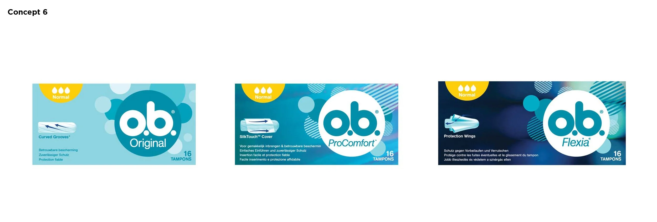
Launched winning design concepts for o.b. tampons, maintaining the #1 tampon brand choice in EMEA regardless of new competitive brands.
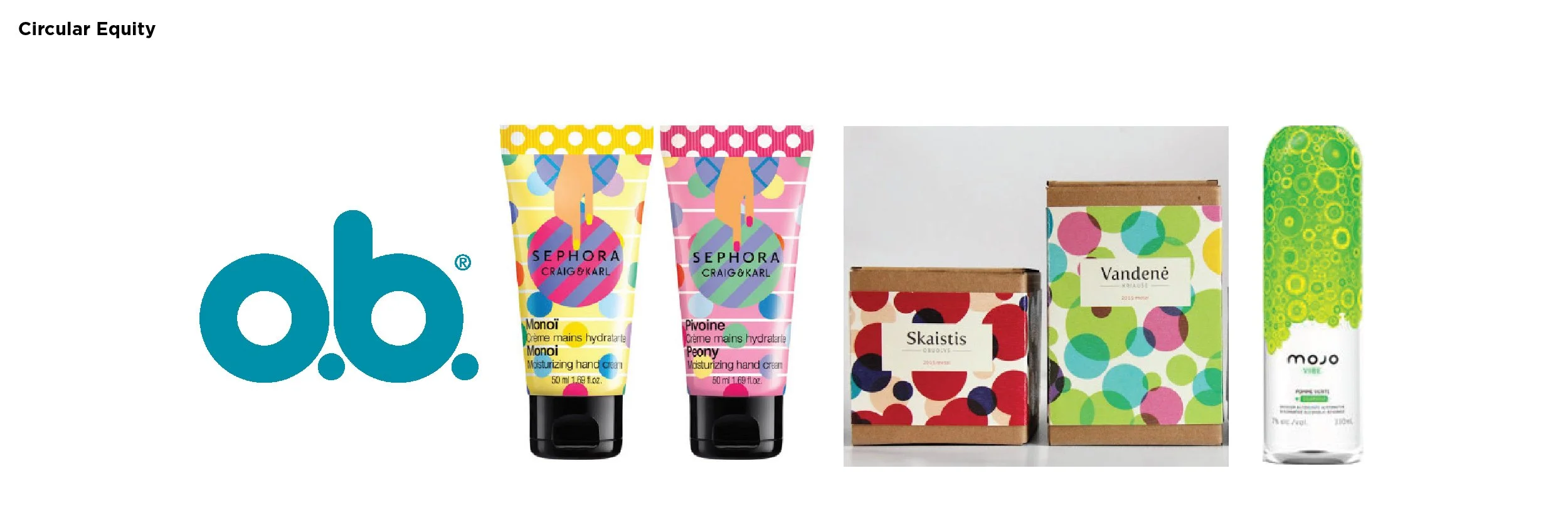
2016: Modernized the brand, reinventing the floral imagery typical in the FemCare aisle and elevating the ownable circular brand equity, mimicking the existing logo.
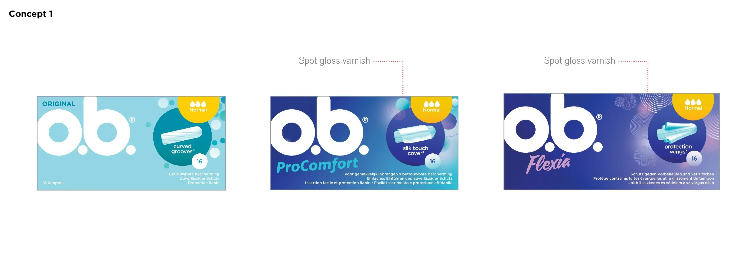
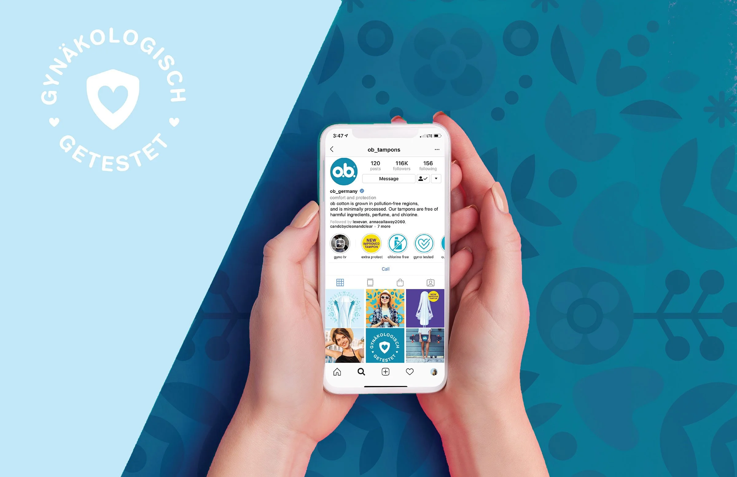
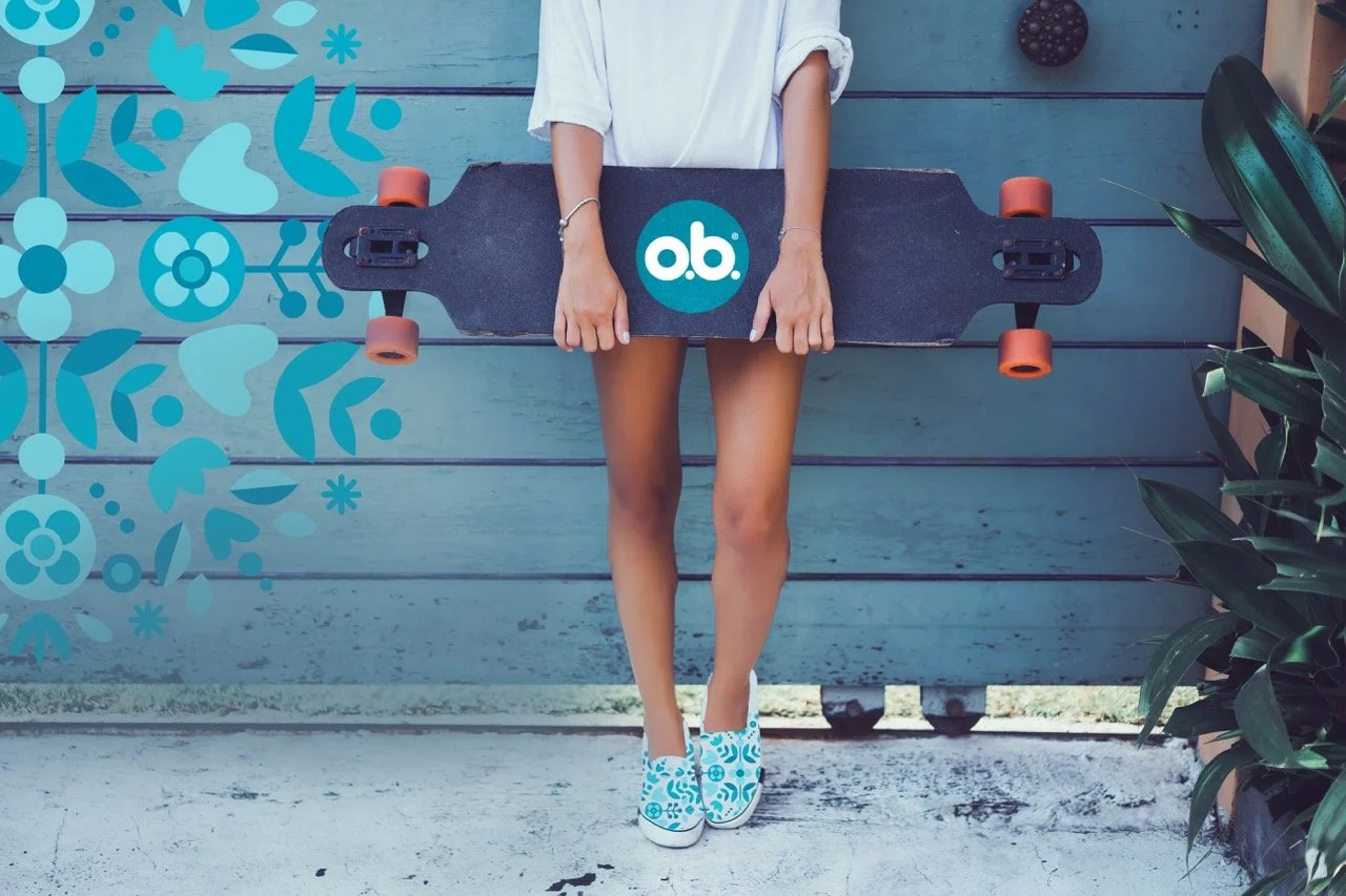
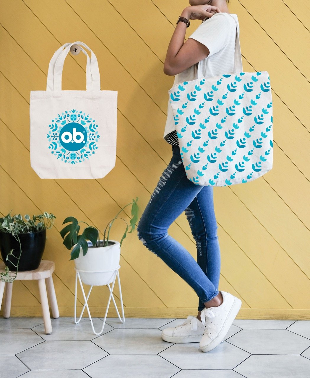
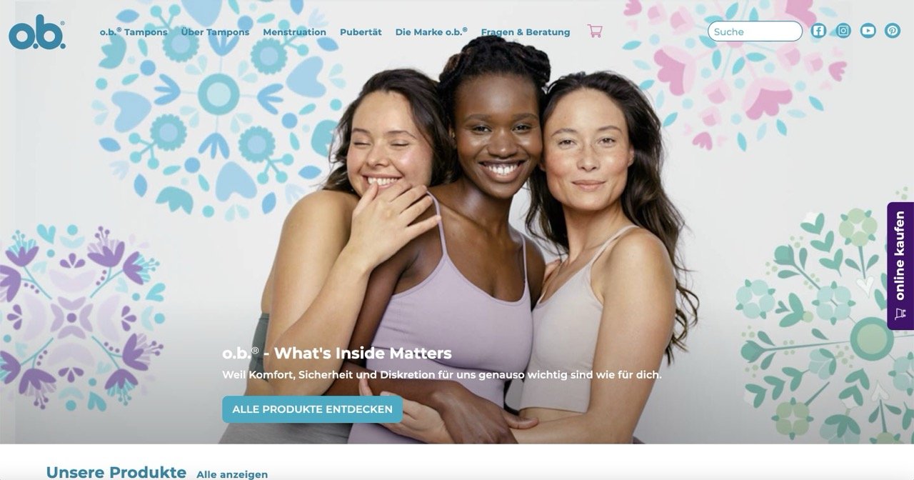
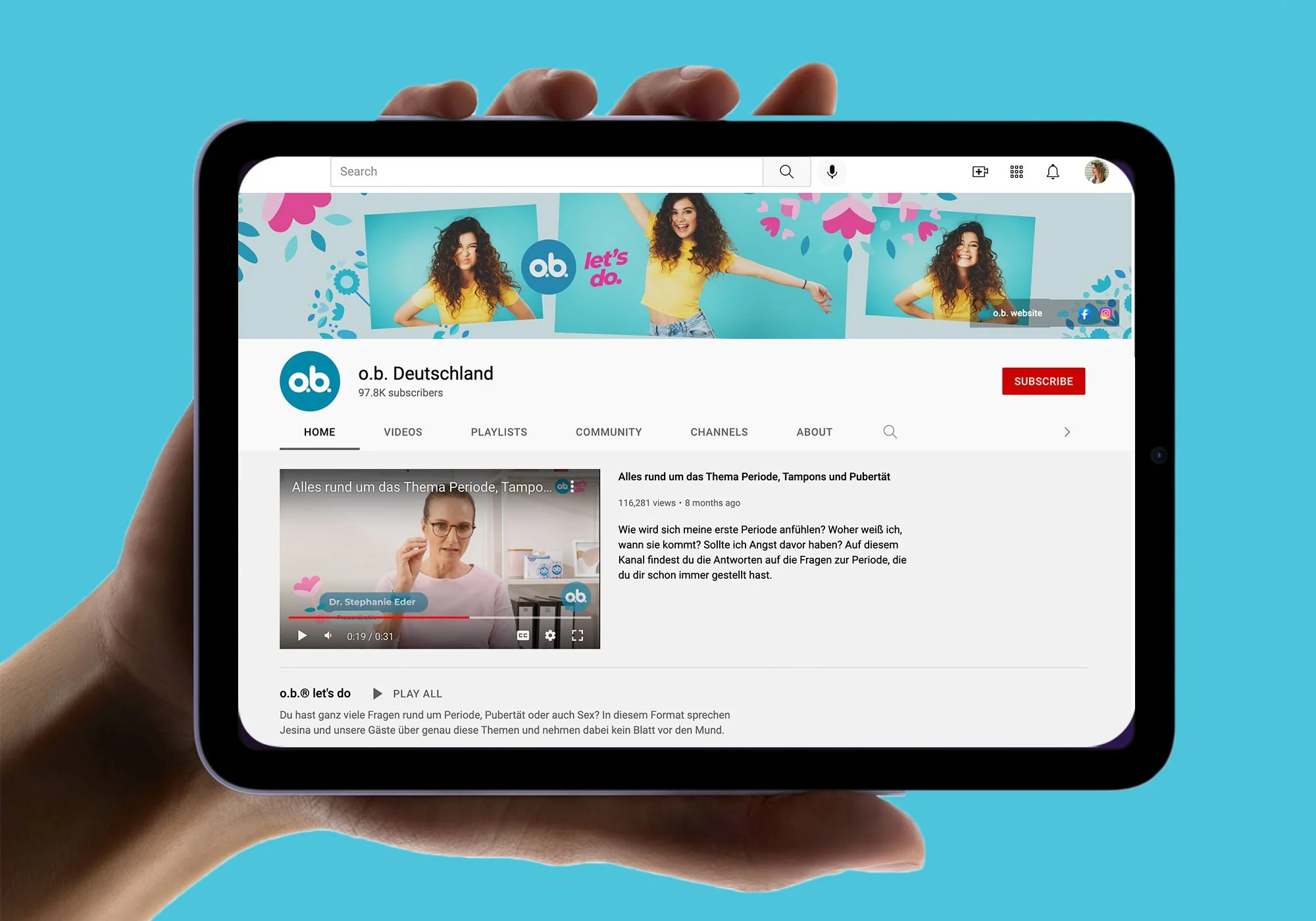
2019: Infused the brand with a more energetic, fun, and dynamic visual system. Strengthened the core o.b. equities, reframed messaging, and gained relevance with Gen-Z consumers. Conveying nature through the graphic patterns. Leaned into ingredient transparency with an all white carton launch— emphasizing free-ofs while also launching an organic cotton SKU.
Concept Development, Brand Strategy, Communication Hierarchy, Packaging Design, Color Strategy, Icon Development
2016 Brand Refresh


Launched (2016)
Creative Director: Tim O’Toole
Design Director: Jennifer Dahl
Design Manager: Nancy Smith
Senior Designers: Melinda Brechbuehler, Lex Evan
Designer: Carolyn Marks
Germany Limited Edition (2017)
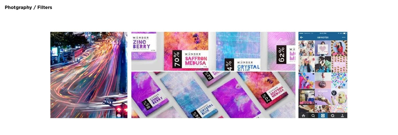
Showcase the o.b. “do-er spirit” that’s part of the brand DNA and brand campaign. Aiming for category entrants, core target age 15-19 years old (wider audience 15-25 years), we were inspired by the experience of music festivals. I oversaw and directed work with Dragon Rouge Agency (illustration credit).
2019 Brand Refresh
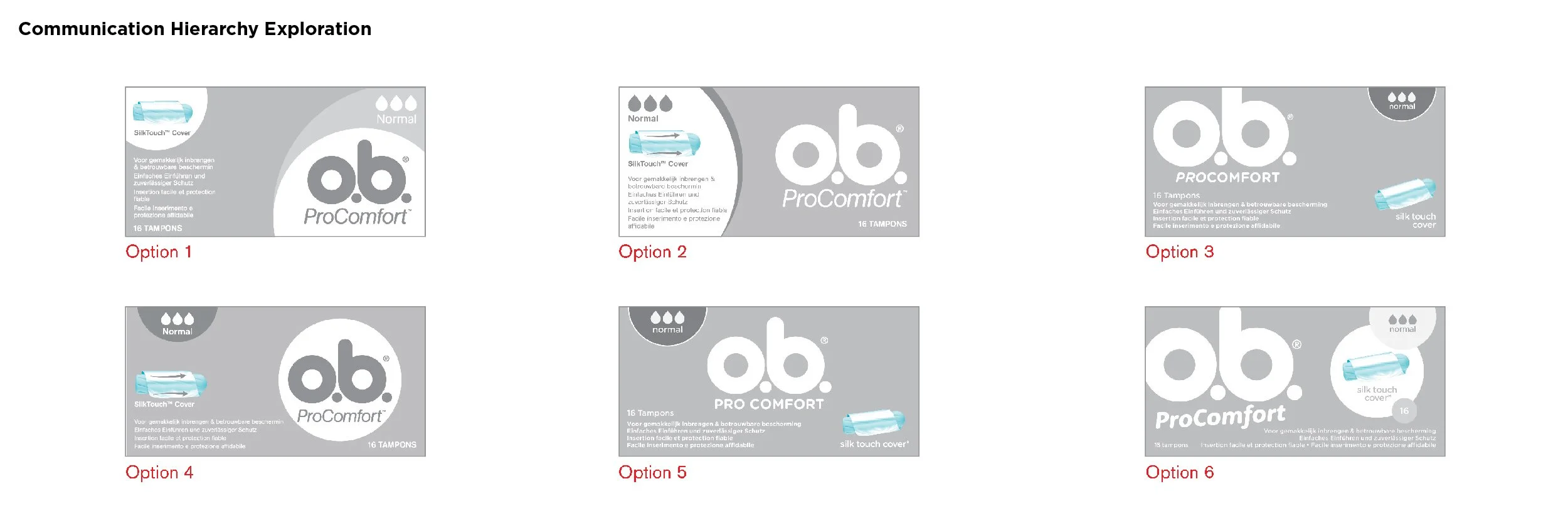
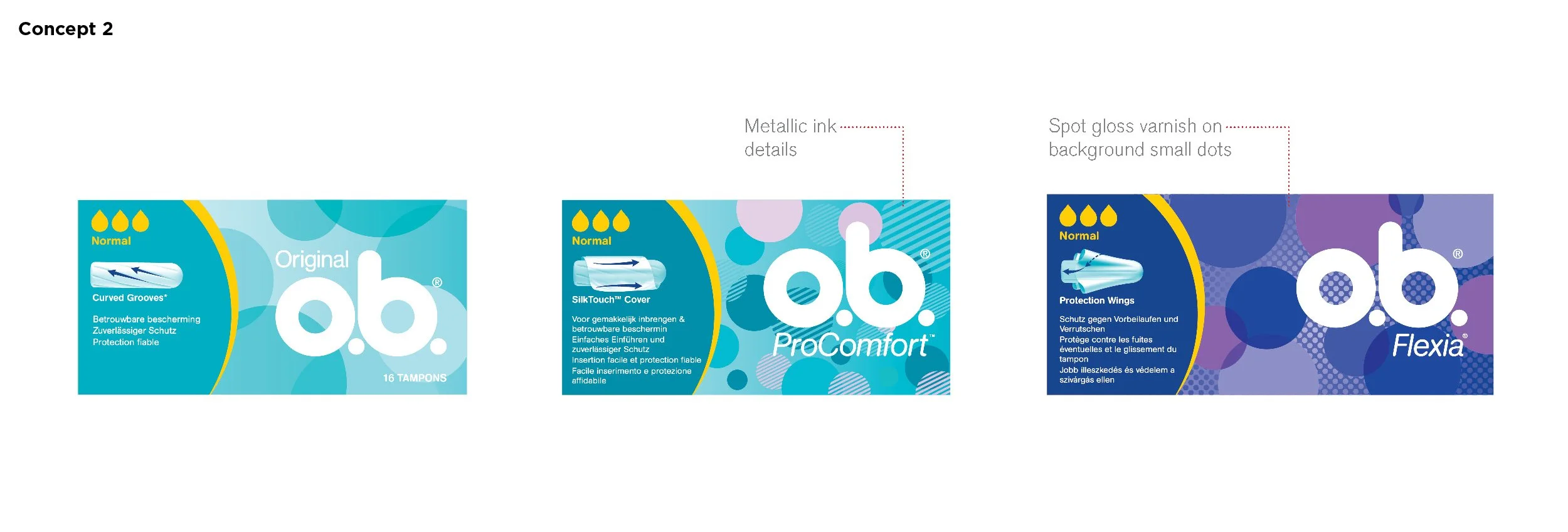
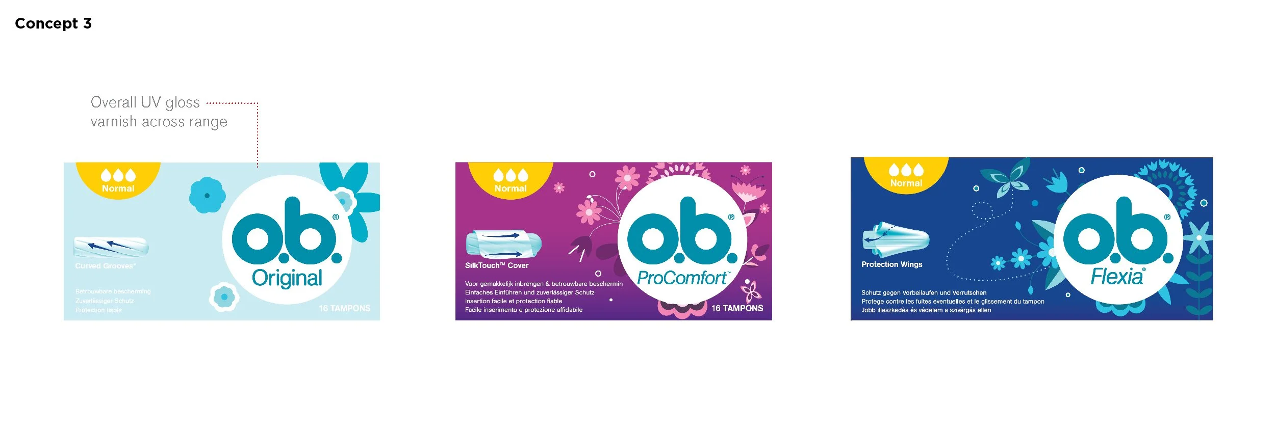
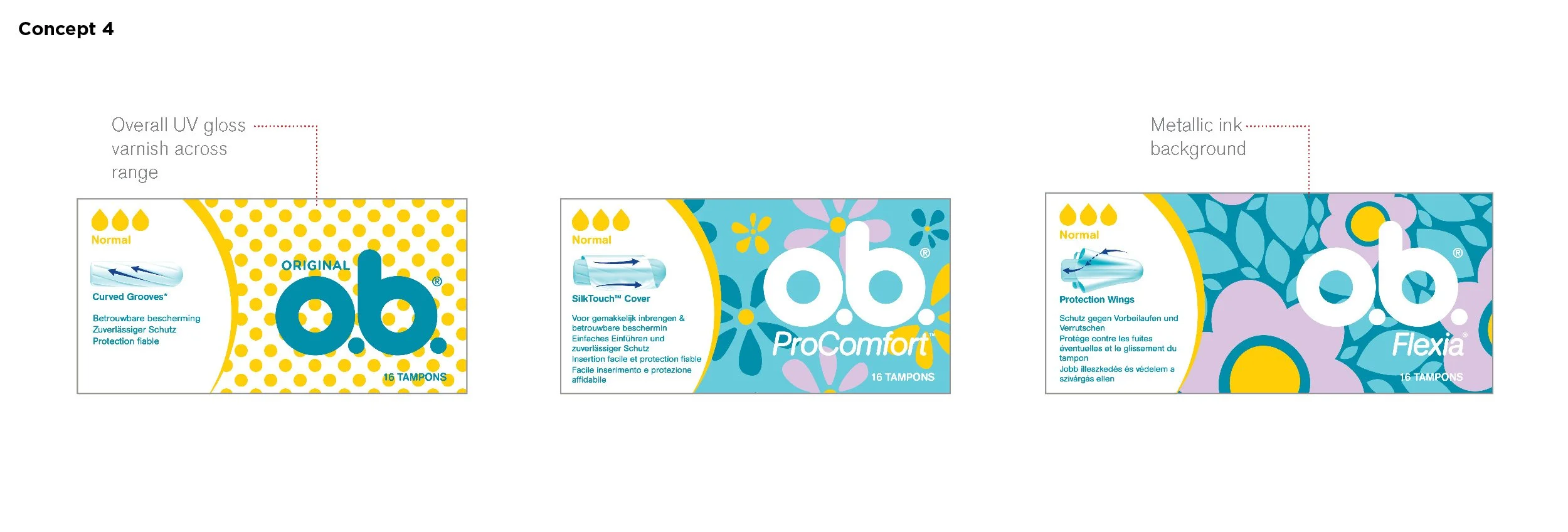
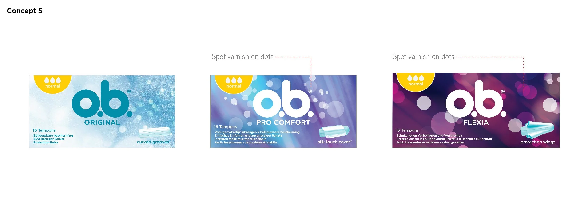
Elevate existing distinctive brand equities & optimize tier differentiation.


Creative Director: Paul Owen
Design Director: Jennifer Dahl
Design Lead: Melinda Brechbuehler
Senior Designer: Alyssa Lagattuta
Packaging Production: Oddesius Perry